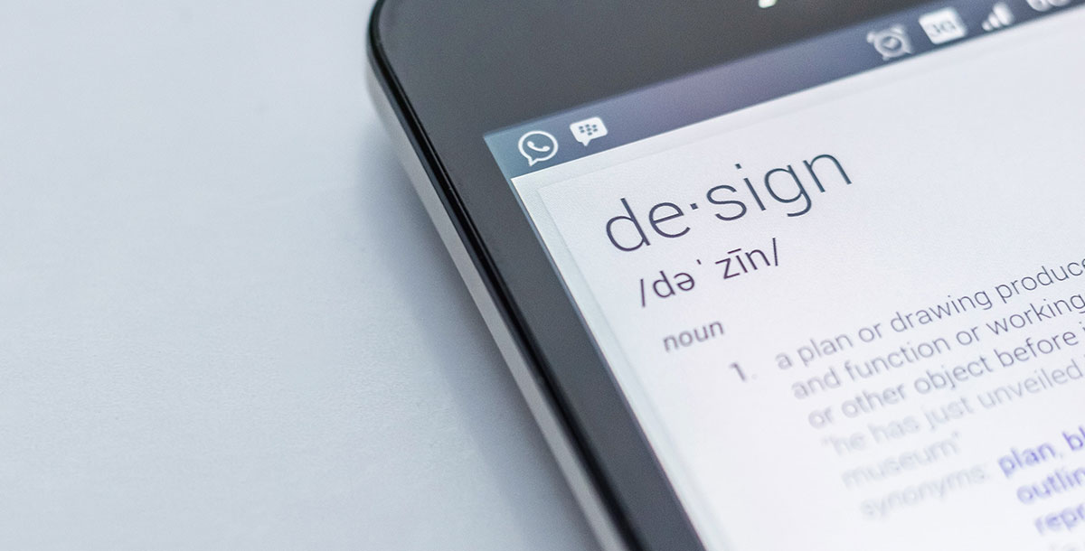
Everyone wants “high-design quality” but what does that really mean?
If you’ve spent time looking into graphic design for your business, you’ll know that there are several different pathways. You’ll also find that you get different levels of quality on each of those paths.
It can be a bit confusing if you don’t have a design background. That design you’re looking at is pretty but does that make it good? What about that different option over there – that also looks good! It’s easy to be bamboozled by choices, so let’s help to make it a little clearer.
What does design quality really mean, especially in the world of graphics for businesses?
Keep it simple
When you’re getting graphic design done for your business, an important thing to remember is that it’s not really for you. Graphic design is part of the package of messaging that you want to deliver for your customers.
Quality design means that it should have simple, easily understood messaging. For example, if there are multiple elements to the design, it makes use of visual hierarchy to highlight the important parts of the message.
You customers shouldn’t have to squint or turn their heads sideways – they probably won’t if the design is that difficult. Any text elements should be quite legible and make use of kerning to discern between letters and words.
In graphic design consider how similar principles apply from website design. People have short attention spans, if they have to spend too much time trying to decipher your message, they’ll probably give it a miss.

Have a purpose
What are your design goals? Every design used in your business needs to achieve something, even if it’s simply “to communicate the name of our brand.” It’s more than that though, isn’t it? Your logo or typeface used for your brand name says something about the type of brand that you are, too.
If you’re working with a designer on a project, outline your long-term goals in order to
- create visual appeal and attract the right audience
- communicate something about your brand image
- be cohesive with other design work you have done for your business
- call the customer to action over something
- enhance customer experience
- communicate a certain aesthetic
Quality design is a visual solution to the goal that you’re wanting to achieve. It tells a story about your brand for anyone who’d like to listen.
Keep it consistent
In a conversation with one of our clients recently, they talked about how they found it easy to get distracted when it comes to design decisions. Basically, when they’re presented with a lot of good designs, it’s like being faced with many shiny objects! How to choose?
Too many designs, no matter how good they are, that don’t coordinate or fit well with one another leads to an overall poor design experience. Cohesiveness is an important trait of quality design.
The best designers will adhere to brand guidelines. This basically outlines the brand standards and overall look, so that the right aesthetic is captured every time and design traits, such as typefaces, colors and motifs are consistent.
In other words, quality design should help reinforce your branding, not create any confusion.
Consistency is delivering your core messages, visual branding, and other brand elements repeatedly across all marketing mediums. The goal is brand recognition in every interaction, building trust and the perception of stability. Quality design is consistent, repeatable, and easily recognizable no matter what visual is presented.
Be original
Design can be inspired by other designs, it can borrow small elements from other designs, but quality design doesn’t rip off other designs. Trademark infringements are no joke to deal with and can frequently involve prohibitive fines. That’s just not somewhere you want to go.
Your design should be original and distinctive. Companies tend to get pulled up for Trademark infringement in cases where it’s clear they could be mistaken for another brand. Logos are one of the obvious culprits design-wise. If you’re applying for a trademark it will get rejected if your logo is too close to someone else’s.
The best, most distinctive designs are original and display creative thought in their conception as well. For example, you might be clever about how key concepts that represent your brand are shown.

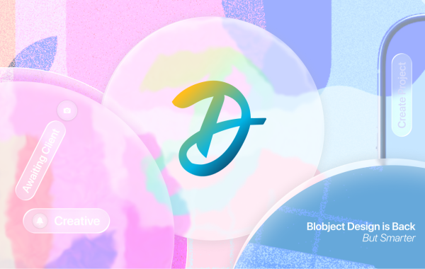
Facebook Sued over Calibra’s look-alike logo
Follow the rules
Design principles are really the foundational parts of what defines a design as “quality.” The elements include; lines, shapes, color, texture, size, typography, and space. Quality design uses some or all of these elements in a balanced way. For example, but not cluttering together and by observing a hierarchy.
Space is often a less-considered part of design, but it’s important. Why is that element where it is? How will it be highlighted? How is it used to separate or group key information? How does it lead the eye where you want it to travel? It’s all about keeping the elements in harmony.
Make it accessible
Accessibility is often talked about in relation to software design, but it is applicable to graphic design, too. Accessibility means that a design can be widely used or understood, including by people with disabilities. Basically, it means your design should be useful, however people encounter it.
What are some considerations for accessibility in design? Your use of color for one thing. If color were the only visual means used to convey information, people who are color blind or who have low vision will be cut out from interacting with your website, or whatever the design is being used for.
Contrast between text and background is another consideration. For example, if you have text in a too-light shade of grey, it will be difficult for many people to distinguish. The same can be said for using form fields where the boundaries are not clearly defined. To be on the safe side, where design involves a call to action, clear labeling should be used, too.
Feel good about it
We said that graphic design is more about your clients than yourself, but in saying that, quality design means that you feel good about it, too. You’ll be proud to show your card, your logo, your website and any other key design elements to others.
The design will represent you well and help to tell your story. It will be recognizable to others too, at a glance they’ll think “hey, that looks like X.” In general, by designing to appeal to your clients, you’ll find it will appeal to you, too.
Look below the surface
“Quality is more than just “skin deep”. What you see, is only 50% of what Designed.co consider quality.” Said Jeremy Lessaris, Founder of Designed.co. “One of the most overlooked parts of quality is the design process, file structure, and file specifications.” Jeremy added “Just because it looks good on screen doesn’t mean the final print or digital product will match. When it comes to print, making sure you understand the material, have the right dielines and safe areas defined, color processes and deep knowledge of print equipment makes a dramatic difference in what is produced be it packaging, brochure or even business cards.” “It’s the same when it comes to digital design” Jeremy continued. “Digital handoffs utilizing the programs and file types can accelerate development times, the same as naming conventions and file/layer organization can assist with delivering pixel-level perfection.”
Final thoughts
Quality design is thoughtful and deliberate. It appeals to the customers you are hoping to attract and makes you feel good about the look of your brand.
The design should tell a story of your company that is consistent, with original logos and a unique look. There’s something almost intangible about quality design. Something that when you look at it makes you say “that’s it.”
Designed.co provides quality design services without the cost and complexity of traditional design agencies. Take a look at what we offer here.