As we head into the busiest time of year for retailers, holiday ad campaigns are usually high on the to-do list.
Your advertising design is where the design features of your ad campaigns meet their marketing intention. You need the visual effect to pop, to help you stand out from the many other small businesses marketing their wares this season.
We’re setting out to answer some of your key questions: what makes ad campaigns effective from a design perspective? Are there any “rules?” Let’s dive in:
Design principles for holiday campaigns
What makes the design of holiday ad campaigns successful? Ultimately, the answer lies with what will entice people to click or to take the action you’d like from the advertisement.
Essentially, we’re looking at what makes a design appealing. Here are a few principles to consider:
Know the target customer very well
The design elements, just like the overall campaign, should be crafted to appeal to the target customer. One thing you should always bear in mind – does that target customer look any different at the holidays?
Who is doing the shopping? Is it your regular audience, or is it someone else, someone who is shopping for them? You’re used to targeting fishing gear at keen anglers, but during the holiday season, people might be looking to buy who have no experience at all of fishing. (Maybe your design could work the “keep them out of your hair” angle?)
This is important for your overall design, as well as any text design elements. For example, you wouldn’t want to use technical language or industry slang terms if they’re not your regular audience.
It may make sense for your business to run parallel campaigns – some for your regular audience and some for holiday shoppers (unless you can successfully combine the two).
Is your target customer different from the usual at the holidays?
Keep it simple
Okay, this is a design principle we advocate for any ad campaign, holiday or otherwise. Simplicity just tends to be more appealing. It’s about getting your message across as briefly (and cleverly) as possible.
What does “simple” mean? You don’t generally need anything over-the-top or extravagant in terms of imagery. Some of our most effective ad campaign designs have been the most simple.
From outside of our work, here’s a great example from a few years ago by Jim Beam. It’s simple and it gets their message across in a clever way:

While the Jim Beam advertisement shows text with no imagery, here’s an example from Lego that shows imagery with no text. It still manages to communicate their message about imaginative play in simple terms.

Lego ad by Blattner Brunner.
You don’t have to go quite as stripped back as the Lego and Jim Beam examples, but they illustrate that it’s possible to get a clear message across without a lot of “frills.”
Consider design hierarchy
One of the principles that helps to keep design targeted and simple is that of design hierarchy. The visual hierarchy of your design refers to how the graphic elements are arranged in order of importance.
Some key points to know about design hierarchy are:
- Most cultures read from top to bottom. (And of those, most read from left to right, with notable exceptions).
- When people scan a page (or your ad) they often read in patterns. An F-pattern is typical for anything text-heavy (scanning down the left side first to pick out keywords). A Z-pattern is typical for less text-heavy pages, for example a web page or your advertisement. The Z-pattern starts at the top left corner, as a regular “z” would.
- Bigger things (words or images) tend to get noticed first. This can override the top down rule, for example if you have a large word in the middle of your ad.
- Space. Any substantial negative space around images or text draws attention to them (the Lego ad above is an example).
- Typeface selection, including weight and style help to denote visual hierarchy.
- Color denotes hierarchy. For example, splashes of color on a neutral background.
- Direction. Where a page is arranged in a typical grid pattern, any change of direction can denote hierarchy. For example, if you have some text on a diagonal.
So, let’s say your ad is for an online banner. You hope to get people to click on your banner and go through to your website to make a purchase. That’s the main goal, so what should be prioritized in terms of design hierarchy?
Your call to action button is definitely going to rate highly, as is your headline with your offer. In terms of design choices, you’ll want fonts that are easy to read and colors that stand out. You might go with holiday colors along with recognizable branding elements for your business.
Think outside the (gift) box
Many holiday ad campaigns focus on the sentimental, because that’s what works for their brand, or, simply because they think that’s what holiday campaigns should be about. One way to stand out from the pack is to take a different approach. If it works for your brand, inject some humor or come up with another clever way to promote your holiday campaign.
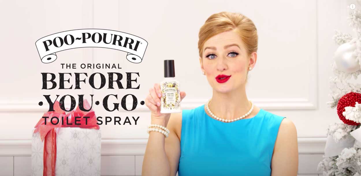
Poo Pourri is an example of a somewhat irreverent brand that uses this image in their holiday marketing. Below is an example of one of their ads from last year. Note that they’ve used a holiday color palette that includes their signature blue from their regular branding. This gives some continuity to their ads:

The Jim Beam ad we showed back in the first section is another good example of finding a different way to market the holidays. It’s simple with a clever play on a popular Christmas carol.
Color palettes for the holidays
Are there particular color palettes that work best? People often opt for the traditional reds, greens and golds, but those don’t have to be the only choices. A palette that looks special for the holidays but still reflects your brand can be a great choice. (The Poo-Pourri ad above has red, but heavily features the shades of blue they are known for).
Envato shared some interesting choices of different types of holiday color palettes that aren’t just red and green here. Consider the mood of your campaign – you could go with muted, bright, bold, analogous… There’s no “best” choice for all holiday campaigns, it depends upon your brand and your customers.
The example below shows a more muted color palette from Envato:
Stand out from other small businesses
We’ve alluded to ways you can stand out from everyone else already. Here are a few summarized strategies for your ad campaigns:
- Your packaging. Holiday packaging can be a great advertisement for your brand and something that immediately makes you different.
- Your campaign tone or messaging. Will you go with traditional? Sentimental? Humorous? Irreverent?
- Your copy. Clever copy can work hand in hand with superb design. As we’ve seen, it doesn’t have to be grand or complex; simple tends to be more attractive and memorable.
- Your overall design. Design is such a great tool to show your creative side and share the story you want to communicate. That’s one design tip we like to keep in-mind – what story are we telling?
Final thoughts
Your holiday ad campaigns can be a great way to not only sell more, but to boost your profile overall. The holidays can be a fantastic excuse to show your fun side and to draw people to the story you tell with your ad campaigns.
Need help sprucing up your next holiday ad campaign? Let Designed.co help “sleigh” your next holiday design project for a low, flat monthly fee. Get a demo or get a same-day quote online: www.designed.co